When creating an logo for a brand you need to create something that is recognisable and remeberable. Why? Because it needs to mark it's own identity in the world. Below are four brands in which I have sketched from memory, ones I feel are recogniseable and rememberable:
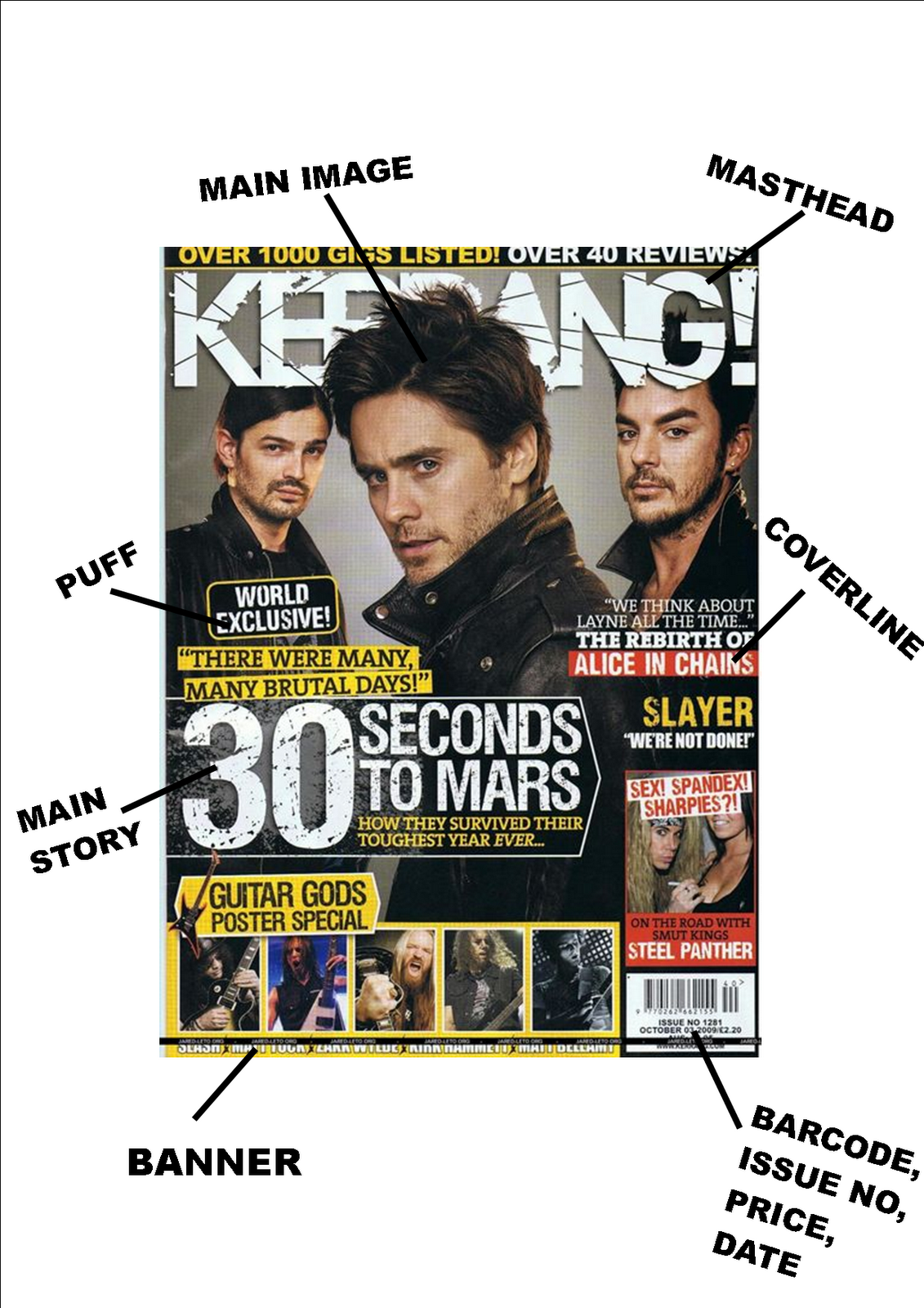
After this I researched a magazine known as The Word and wrote up answers to a series of questions in which tell you what I think the masthead means and symbolises. Down below is what I came up with:
After deciding to take on the genre of country music I began to brainstorm things that I associate with country as a way to help spark of ideas for the masthead of my magazine. The things that I came up with were:
Tooth Pick
Big Hair
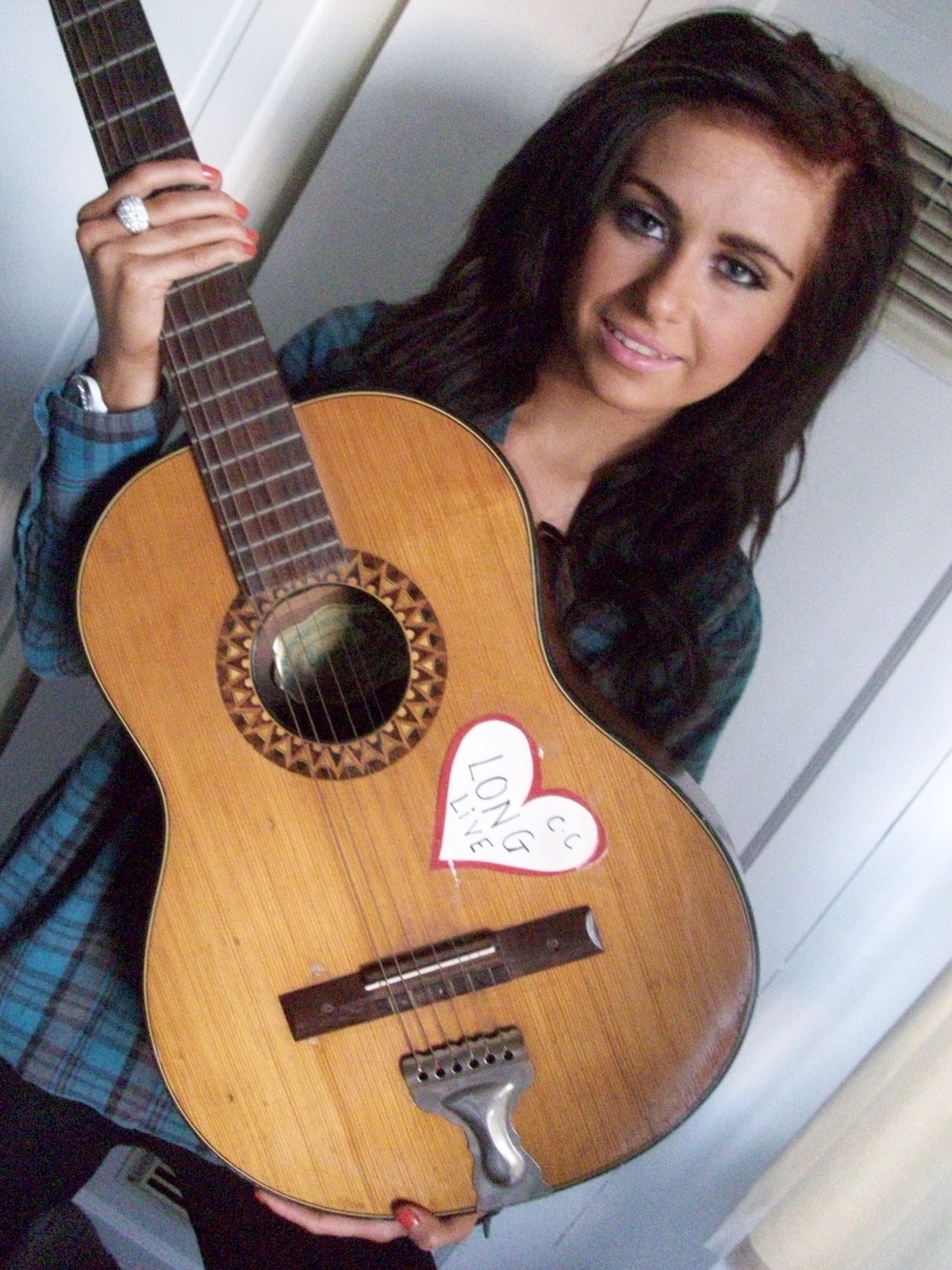
Acoustic Guitars
Cowboy Hats/Boots
Banjo
Cows
Haystacks
Plectrum
I then began to think of famous country singers and the ones that I came up with were:
Tim McGraw
Taylor Swift
Carrie Underwood
Dolly Parton
Keith Urban
Billy Ray Cyrus
Once I thought of these famous singers I had an idea of what I wanted do. I wanted to use a song most people would know and could relate to country music but I couldn't think of one that I thought would appeal to all generations and not just a younger audience. The ones I thought could be possible mastheads for my magazine were:
Teardrops on My Guitar
Country Roads
Tim McGraw
After thinking of these and not liking them I decided to try and think of stereotypes most people would instantly recognise as country and some of the mastheads I came up with were:
Beer & Chevy Trucks
CowboyBoots & Beer
Plectrum
Ukulele
But after awhile I gave up on trying to make a name out of stereotypes because I thought it was to general and made it hard to tell what the magazine was about other than something country. While trying to think of a new angle to take it from I ended up with the song Country Roads going through my head but with a change in the lyrics: Country roads take me home to my heart and soul. Not long after this did I stop trying to find a new angle because I thought it would make a good masthead and tagline. So, I did indeed finally decide on calling it:
Country Roads
take me home to my heart and soul.
When it came to designing my masthead I had a rough idea of what I wanted but actually finding a font or figuring some way I could actually make it was going to be a challenge. At first I decided I wanted my masthead to look like the font had hay coming out of it to try and get across the theme of country. I found a font that looked like it but before creating I already knew it wouldn't look right due to font colours. However down below is a sketch of what I had tried to create:
At the same time of creating my magazines logo I also did an evaluation of my own magazines masthead and what it means and what it symboloises. Down below is what I came up with:
Instead, I found a font called 'Whiskey Town' that reminded me of country. So, I began to design around that. Below are images of three different fonts I made:
I decided that I liked the middle one the best because it had the most design thinking behind it, in my opinion, as I had tried to make it look like a road.
Soon after deciding on what masthead style I wanted to use I figured that the colouring didn't really work and so I changed it to my final design:
For my magazine I have decided on having a sub-genre of country pop. The reason I have decided to have this as my sub-genre is because currently Taylor Swift, Carrie Underwood and Tim McGraw are big, popular country musicians. Their country sub-genre happens to be country pop and so I believe that will appeal to a wider audience range.