Pages

Thursday 31 March 2011

Final Product

Front Cover:


Contents Page:


Feature Pages:


Wednesday 23 March 2011

Evaluation

In what ways does your media product use, develop or challenge forms and conventions of real media products?

Masthead


In some ways my masthead follows the traditional use of conventions but in others it challenges it. The traditional way in which I used conventions is within the size of my masthead – it’s the most prominent text on the page. I also followed the traditional conventions with my style of font. The font, from Dafont, looks block-like but less bold than usual fonts. The reason I chose not to break this ‘rule’ was because I feel like country music represents home and for a magazine it is the norm to have a block-like font. However, the challenging form I used was the thin lines above the main font to symbol a road. I chose to do this because I think it helps make my font stand out in a less obvious way and that is one of the main things you want to do when creating a masthead as it helps the buyer remember it.

Design

Firstly, I’m going to talk about the colour scheme and how it gives my magazine brand an identity. I chose to go with soft, warm colours like yellow and pink with a hint of brown. I chose to do this because my brands identity is meant to feel like home and to me home should be a warm, gentle and friendly place and so, therefore, these colours give my magazine that feeling. For my fonts I chose to be consistent with the font Arial throughout my front cover, contents and feature page. The reasoning behind this decision was once again to get my brands identity out there. Home is meant to be a place of consistency, never changing as it’s always there to fall back on and so having a font that never changes gives my magazine a consistent feel as if it’s never going to change what it gives to its audience.

Image


One of the images that I used was on my front cover and was a medium shot in which holds a plain coloured background. I chose to do this to get across my brands identity as I feel that it represents the simplicity of home. In the image on the front cover I have dressed Chevy in a checkered shirt in order to create a country ranch-worker-style feel. I chose to use the prop of a guitar because I want the reader to feel as if they know Chevy – music is her life; her heart and soul and they know that. I chose to have my image as a medium shot as I feel that it’s close up enough to see her facial expression and gives her a friendly feel which after all is what my brand identity is supposed to feel like.

Language

Throughout my magazine I feel like the language that I used was friendly, warm and reassuring which makes me think of a mother type figure at home talking to their child. It’s as if the magazine is the reader’s family. On my contents page I wrote a little note to the reader that feels as if I am giving the reader a little advice without truly giving them advice – it’s reassuring and possibly could inspire them to do something they wouldn’t have done alone. I’ve done this by embedding song titles in to it: “long live” and “one last time.” On my contents page I have embedded many song titles in to the sections of what's inside. I did this because I think some of them are also inspirational titles and can convince the reader to turn to the page of the article and hopefully be inspired by what they find.

Layout

For my front cover layout I used a mixture of conventions: cover lines, a banner and a puff. I feel as though my front cover is conventional and doesn't challenge the traditional much. The main cover line used is about the main image on my front cover. Of course there are other cover lines on my front cover about other articles that are in the magazine. The banner and puff used on my magazine front cover interlink together and to me that gives it a less obvious challenging kind of feel towards the front cover as it’s not something that you often see. For the layout of my contents page I used the conventions of a puff and categories. I feel as if my contents page layout doesn’t challenge the traditional layout because I wanted to use things that the reader are used to seeing as that helps push out my brand identity of stability. The one way I feel that the contents page challenges traditional is with the categories. It’s not much but the categories have only three and the third one is called the rest. To me this gives the contents a slightly unorganised feel but I chose to do this because I don’t want my magazine to come across as perfect as no home is perfect and most homes have some sort of unorganised state to them but that’s what makes them feel like home as it’s always that way – it’s open and friendly. The final part of my layout was on my feature where I did not challenge at all. I kept it very simple and traditional adding in pull quotes and columns. I chose to do this because I feel as if it’s the centre of my magazine and I believe that the centre of a home should be the part you recognise and feel most comfortable with and by keeping it traditional I think that is what I have been able to create with my feature.  


How does your media product represent particular social groups?


The particular social group in which my magazine is meant to represent is the happy-go-lucky, friendly, family orientated people. I see my social group as the type to wear pastel colours - as I think it shows of how friendly they really are. They don’t wear vibrant as that would represent them as overpowering, in-your-face type of people. They don’t wear dark clothing as I feel that gives of a negative effect and therefore represents them as a moody type of person. I also feel like they are the type of people who wear ranch-work-styled, plaid tops. The reason I think this is a common thing they wear it because it shows of how they are working/middle class, down-to-earth people. Below is an image of a country artist who is sporting the type of style I’m talking about:


Another way in which my magazine represents my social group is through the body language of my artist in my pictures. I have images of her up close giving the feel of open and friendly and the ones I used with the balloons give the reader a feel as if you are looking at her thoughts as the main focus is on her face in the midst of the balloons:


What kind of media institution might distribute your media product and why?


Although my magazine is aimed at an independent audience I want my magazine to be distributed by the two major distributors: 


I want these ones as they distribute products to the big selling stores like: WHSmiths and Tescos:


Although this will mean they will have more control on what is put in my magazine it will also help get my product out there a lot quicker than if I went the independent way. I want it out there as soon as possible as there are not really that many country music magazines out there. Right now, country music is on a rise with artists such as Taylor Swift and Rascal Flatts and so I believe there will be a lot of people who are going to want a country music magazine.


Who would the audience be for your media product?


For my magazines audience I chose to aim it at country folk which I believe to be family orientated, happy-go-lucky people who radiate around the roots of their upbringing. I aimed my magazine at the demographic of B-C because I believe that my readers will have jobs that bring in a liveable income. Jobs like a teacher or ranch worker. I think they’ll have a lifestyle that is very family orientated; the type of people who will spend their Friday night with their family having a family night or a night in with their friends listening to country music. I believe the main target age for my magazine is 14-18 year-olds as I think they will be the type of country-music-lovers who would be interested in truly finding everything out about their favourite artists. I also believe that my magazine will mostly be read by white females. I say this because a lot of country singers are white and therefore white young girls are more likely to look up to them for ideas on how to live their life’s more than a young black, Chinese, etc girl is, they are more likely to look up towards someone the same race as themselves. The type of artists I think  will most likely be looked up at by my readers are Taylor Swift, Carrie Underwood and Kellie Pickler:


How did you attract/address your audience?   


One of the ways that I attracted my audience is through the colouring I used. As I have previously stated before I believe that the type of social group I am aiming at like a lot of pastel coloured clothing. So, for my magazine I chose to use some pastel clothing a lot with a few darker colours. The reason I chose to do this was because the pastel colours give of that friendly, warm feeling and the darker colours make it seem more solid, grounded which is what represents the conventional family – always a place of familiarity. Some of the colours that I used:


Another way in which I think I attracted my audience was with the way that in my article I addressed my artist by her first name: “Chevy.”  It’s a very small way of using language but I think it gives a very subtle personal feel to it. It doesn’t seem over-done; I’m not trying to create a true country sense with words like: “howdy” and “y’all.” For some of my readers I believe this may be a turn off as it is stereotypical and country artist don’t all speak like that and so neither do all my readers.

The final way I am going to speak about is my free download advertised on the front cover. The reason I think this will attract my readers attention is because on the cover they do not find out the artist and so therefore will want to know who it is and buy the magazine. Secondly, this will attract my potential customer as it is a free album and not just a song. They are saving a lot of money which would attract quite a few people simply because of that, possibly even ones who are not big fans of country music. 


What have you learnt about technologies from the process of constructing this product?


When creating my product I used two types of editing software: Adobe Photoshop CS4 and Macromedia Fireworks 8. Photoshop is where I created my magazine product. It’s where I laid it out and actually edited my pictures. The main editing technique I used was to cut out my pictures. I did try to do on Fireworks but I found that it wasn’t as easy as Photoshop because it didn’t always give you a soft edging around the picture. Also, it wasn’t so easy to editing things out if you had cut out something that you wanted. Another editing tool I used on both software’s was a stroke of black around my text. Once again I found Photoshop was easier because it gives you the option whereas on Fireworks you actually have to create the stroke yourself. The first problem I found with that was that it isn’t always the same size the whole way around and the second problem was it turned out with an angel glow instead of the solid stroke I was aiming for. One of the other things I learnt during my process of using Photoshop was layering. It easily enabled me the option to hide certain things that I wasn’t sure I wanted but didn’t want to delete as I’d have to do them again. There’s a button available that simply lets you hide something:

When taking my own pictures I discovered that although I had the ideas it wasn’t going to be so easy to create them. For my first idea I had wanted to actually go to a field and take pictures so it gave it a country effect. However, it was winter and snow came and so there was no location where that was actually possible anymore. My second idea was better and I found out that although the room I used was dark due to the dull weather coming through the window I could easily brighten up pictures with my cameras flash and I could use different flashes to get the right amount of light. One of the problems I did experience was that if your camera doesn’t have the highest quality of pixels then your picture isn’t going to look as good. On Photoshop though I did try my best to reduce the amount of little flecks of colour my camera had picked up but it still left my picture with a poor quality feel to it, just not as worse as the original one – in my opinion. 


Looking back at your preliminary task, what do you feel you have learnt in the progression from it to the full product?


During the making of my actual magazine I started to get a doubt that this one was worse than my preliminary task but now that I'm looking back at the final product and my attempt at a school magazine I’m seeing that that was wrong. Just by my image I think you can tell which one is the real one. In my preliminary task I chose to keep my background which automatically gives my magazine a less than real feel. Where as with my final product there is not background and the image is solely focused on the artist. The second thing I noticed straight away about my preliminary task was that my cover lines were not really noticeable as a real magazine, which once again gives them the less than real feel. With my final product you can tell the difference as I have made them stand out more in order to not only make them readable but to also catch the eye of the reader. Another thing I noticed on the preliminary task is that the colour of the font I used isn’t very eye-catching and blends in to the background which I avoided doing on my final product as I want my readers to be able to read what is being said even from a little distance. The final thing I think has definitely improved is my understanding of how to lay things out in a magazine. With my preliminary task I feel as if I didn’t put much effort of thought in to it. I just put things anywhere. Where as with my final product you can see that I’ve tried to use layout conventions like puffs and banners in order to make things stand out and it to seem more realistic. I’ve also used the whole of the page and not just aligned it to one side – I haven’t wasted space.  

Friday 21 January 2011

Feature

For my magazines feature page I wanted to create something in which allowed you to get inside the mind of the artist and I soon found something in which inspired the first page of my feature:


The idea that crossed my mind was that I could have the artists name and around them words or phrases that had something that reflected their personality or life.

The first version of this page I came up with was this:


I then decided that I didn't think the colour scheme reflected my magazines brand very well as the red was rather harsh in contrast to the black and pale pink. So I changed the colour scheme to the one down below in which has a lighter background colour in order to bring out the warmth of the purple used:


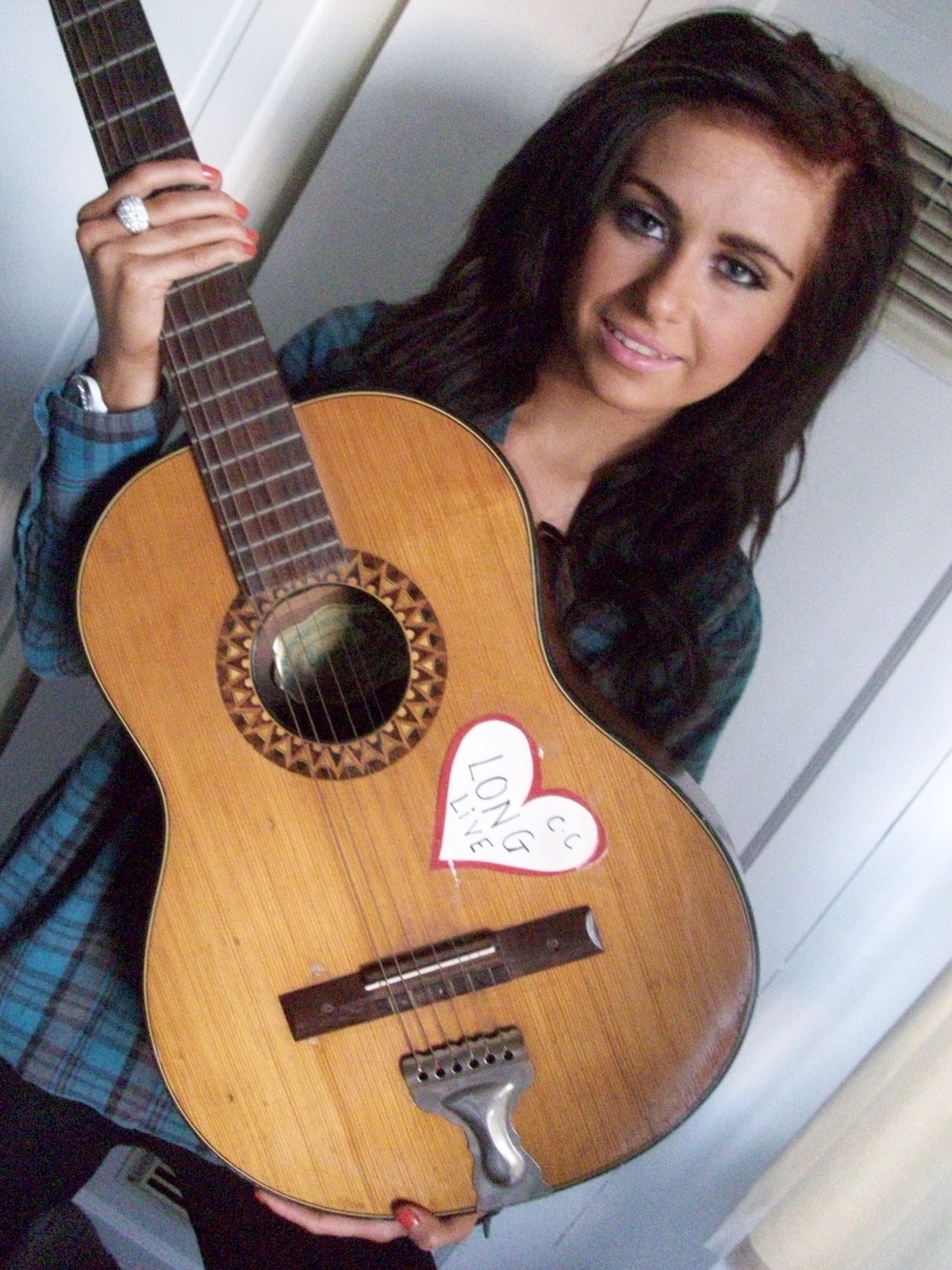
Happy with the outcome I finally put in my picture of Chiles and produced this:


I soon created my final version with a few changes made to it, also a name change for the solo artist of my magazine feature. Below is the final outcome:


Now on to the final page of my feature. I wanted to keep it all very simple and close together as I wanted to once again represent the branding of my magazine - the simpleness of family and the tight bounding bond between relatives. The first one I produced was this:


However, with this one I decided that the closeness of the text on the page was a little too much and so I decided to space it out more. I also like before changed the colour scheme to make it seem less harsh on the readers eyes and more warm. Below is what I produced as a second version:


Happy with the layout I had produced I decided to add in a few more touches to my magazine feature. Another photo, a pull quote and some decoration to the page. This is what I produced:


And adding in a few more subtle adjustments to make my feature really come to life as if it could be real I created this:

Contents

Down below is an example of an actual country music magazine contents page in which I have annotated. Although it is a real example of a country music magazine contents page I don't like it. The reasons I don't like the contents page is because I don't think it shows what type of magazine it is unless you actually read what is inside. Another reason why I don't like the contents page is because it doesn't actually have any pictures that shows what is going to be inside on the following pages. The final thing I really hated about it was the fact that the contents page is black and white although other parts of the magazine are not. I don't thiink it represents the country genre too well.

However, the one thing I do like about it is that it advetises in bold. It's a good way of trying to get people to buy the magazine, it intices them in and after looking at the front cover of the magazine the next thing people will look at is the contents and advetisements draw people in.

Down below is the first version of my contents page:

The first thing I didn't like about this version of my contents page was that the brown banner seemed to be overpowering my colour scheme and so I changed it to the one below this text:

However, the banner on this page looks overpowering itself in size and so I'm going to make it smaller. Also, I need more headers for my contents pages sections and so I'm going to add in another one. One other thing I'm going to do is add in a promotion with a picture in order to entice the reader more.

Down below is the third version of my contents page in which shows all of the changes made that I spoke about above:


The final version of my magazine's contents page really has one change that is very easy to miss but had to be done after changing my solo feature articles name. So, below is the final version:

Front Cover


The image above is the first version of my magazine's front cover I created. However, there are easily a lot of problems with it. The first noticeable one being that the bottom banner is more prominent than the masthead which should be the first thing a viewer see's. The next problem with my front cover is the actual image itself. The main focus should be Chiles but the shot is too far away from her. Also the background of the image doesn't feel country enough as you can see it is just a back garden.

How do I plan to edit this out?

Well, I was thinking of maybe changing my mastheads main font because I don't think it stands out enough. I'd rather it have the black stroke around it like all the other texts does as then I believe it will stand out. Also, I'll make the banner smaller and edit out the stroke around the text so it's not as bold but is still eye catching. To sort out my problem with the image I'm going to take a new one without the background. The reason I'm doing this is so I can cut out Chiles and have the shot focusing on her and her lost state. Then with this I'll take off the stroke around the coverline text as I my coverlines will be readable without it.

The image below is with the changes I spoke about above, hwoever, I didn't change my masthead as I wanted to see what it looked like if I kept it.


The image above is the third version of my magazine with all of my edits and extra ones that I didn't like on my second. I changed my masthead to one with the same type of idea, although not as clearly seen but it is clearer to read and noticeable on my front cover.

However, I made a few minor changes to it. I made my puff smaller as I think it takes too much room up and I used my banner to advertise something that is more likely to gain the readers attention. Below is what it came out like:


After changing my feature article's name I had to go back to my front cover and change it there too. So, below is the final outcome of my magazine's front cover:


Tuesday 30 November 2010

Drafting Text / Page Layouts


The image above is what I decided I wanted my front cover to look like. I sketched it out deciding on a sort of preppy, colourful look as a way to push out how I think my magazine is family-orientated.

Before I began to create my feature article I began to think of ideas that I wanted for my first page and what I came up with was this:


For the first page of my three page article I wanted to have a page solely dedicated to an image of Chiles. The image being one to give the article a theme - it let's the reader know what it is straight away.

Shooting / Selecting Images

For my front cover image I had the idea of creating an image that represented isolation. So, I chose to take my picture when the weather was gloomy and had been raining. Down below is a couple examples of photo's that I took:

On the first image I was trying to decide what type of lighting to use: flash or go natural. I also was trying to figure out the angle of the shot.

I chose to go with the natural lighting and this angle but still I didn't like it too much.

This image above was the one that I decided to use for my first version of my magazine. I chose this because I thought it represented the isolation well as it's taken from a distance and looks very dull in colour. However, for my front cover it did not work as the image wasn't the first thing you noticed.

To create my front cover second version I held another photoshoot with a different idea in mind. Instead of doing isolation I wanted to have an image where it showed that something was close to the heart. In the images below my model is holding the guiate close to their heart and on the actual guitar is a heart with the phrase: "Long Live." This is a song that goes well with my features story and so on the guitar I placed it in a position where I think it would be in line with her actual heart. Down below are versions of the image I was trying to create:

On the first image I was working out the lighting and what type of shot I wanted it to actually be.

On this image I'd worked out the lighting and that I wanted it to be a medium shot.

On the final image below I worked out what angle I thought worked best.